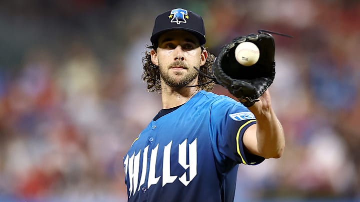
The Phillies were well more than due for Nike's annual City Connect jerseys ever since they were introduced by the Swoosh brand back in 2021 when teams like the Chicago White Sox got cool Southside uniforms, and the Boston Red Sox got uniforms like the Eagles tried to pull off back in the day (Yes, those ones). The NL pennant 2022 season and 2023 season came and went without anything new for Philadelphia, as iconic as the Powder Blues are.
And then we reached the current season and right at the beginning, after 20 of the 32 teams had got a taste of Nike's new concept, the Phillies were the first new team in 2024 to introduce their City Connect uniforms. And right off the rip, even when the designs were leaked days before, fans were livid at the final product.
Phillies need to dump their City Connect uniforms next season
On the day of their release, which not only coincided with WWE World coming to town the day before WrestleMania 40 but also an earthquake in the area (experiencing both at the same time was a trip), fans gave reactions from "give it a chance" to downright "atrocious."
Now to be completely honest, being at the game against the Toronto Blue Jays and seeing Bryce Harper consistently hitting home runs and grabbing a City Connect bucket hat. The bell design for the hats is not the worst-looking thing in the world.
It's the fact that the jerseys are just way too blue and not enough yellow. Don't worry there, because when J.T. Realmuto gets behind the plate, you can expect a retro X-Men Wolverine look with his catching gear. Even backup catcher Garrett Stubbs was not exactly fond of them.
And please don't get started on the giant "PHILLY" font on the front of the jersey, which is then translated to the numbers on the back. Trea Turner's "7" looks like a question mark. The font looks like it was made for some mediocre rock band looking to make it big in the music world. It does not look like it is made for a scorching red-hot professional baseball team like the Philadelphia Phillies.
Phillies' record in their City Connects seals the deal
And here is the most important kicker to all of this. The Philadelphia Inquirer columnist Abraham Gutman pointed out after the Phillies lost to the New York Mets 11-3 in a rare Nola stinker, the Phillies statistically perform worse in these uniforms than any of their other ones.
To be exact, they're 6-6, a .500 winning percentage, wearing the uniforms for Friday home games. They're 46-20 in the rest of their home games, for a .697 winning percentage in any other home uniform. The sample size discrepancy here is decent, but you see how this cannot be the greatest of looks for the Fightins. Luckily, with Red October looming around the corner, we won't have to see these in action for the duration of the playoffs.
Nike should simply remix the Powder Blues, or honor the heritage of the team and its past like the 76ers are doing next season with their Spectrum-inspired look. Do something with the Vet, or heck just have Bryce Harper design something.
We can trust him more than the iconic sports brand to know what is best for the city of Philadelphia when it comes to apparel for both the players and fans alike.
