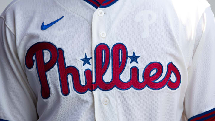
If you were dreading April 5 as a Philadelphia Phillies fan because of the unveiling of the team's official City Connect uniforms, you were right to worry. They are needlessly and predictably bad. And, frankly, kind of generic.
In truth, we knew what was coming months ago, as leaks and whispers all but ruined any element of surprise. We were left hoping that this was somehow a hoax along the lines of the Flyers' fake Winter Classic jersey fiasco from over a decade ago that thankfully turned out to be patently false.
There was no such luck this time for Phillies fans. Even the fact that the team announced the unveiling on April Fools' Day seemed like a bad omen.
Coming soon 👀 pic.twitter.com/vraF2eU4bo
— Philadelphia Phillies (@Phillies) April 1, 2024
Instead, we are greeted with this blue, yellow, and black — what's a nice word for monstrosity? — uni kit that essentially pays homage to the colors of the Philadelphia city flag with a modern twist. But, frankly, who cares about that? Didn't we learn our lesson from those Eagles uniforms 15 years ago? I guess not. The hat is probably the best part of the outfit, with the skyline set against the Liberty Bell, but it seems muted on the black background.
They're telling us that "Philly" is different from "Philadelphia" because it encompasses all of Phillies Nation, and you can have that mentality in you even if you're not from the city proper. I suppose that's right, and it sure helps expand the base of people who might open their wallets to buy these hats and jerseys. So that was a smart move, at least.
Unapologetically Philly. pic.twitter.com/8XzfifuZOR
— Philadelphia Phillies (@Phillies) April 5, 2024
Sorry if this sounds too "oldhead," but there isn't much that's redeeming about these duds. The font choice is bad, and the lack of any other visual features goes against what some other teams have done in more palatable City Connect offerings.
The Phillies are also the third team to use a yellow and light blue motif, after Boston and Milwaukee. At some point, just accept that you were beaten to the punch and try something different. Maybe the heavy use of black was their attempt at that. And perhaps they end up looking better on the field when the players are in action. Who knows?
I also admit that there is a selfish component of this on my part. I currently have tickets to two Phillies home games this season, and they are both on Fridays. Ugh. You're telling me that I have to watch the team perform in these both times? I suppose it's my fault for only doing what my schedule can accommodate, but I will sorely miss seeing the spiffy powder blues or even the standard home look.
I think that people will quickly tire of these things, whether they're at the park or just watching at home. And one can only hope that this is just a temporary blip that will be corrected in a year or two when MLB comes up with its next uniform theme.
Oh, and don't think I'm not aware that the Eagles' offseason activities officially begin on Monday, April 15, meaning that the Birds will take over the dialogue and allow the Phillies to escape the lion's share of scrutiny among Philadelphia's sports media.
As one final note, the Phillies will don these threads for the first time on the exact 20th anniversary of the first official game at Citizens Bank Park. Where does the indignity end?
One week. pic.twitter.com/xjEIUeDvw4
— Philadelphia Phillies (@Phillies) April 5, 2024
Anyway, I challenge anyone to defend the new City Connect uniforms. Philadelphia has contributed so much to our country, the arts, food culture, and more. And this just looks like something you'd find hanging in Beavis and Butt-Head's closet.
They're not the worst thing I've ever seen, but the early leaks and the dread leading up to Friday's reveal that took the place of any sort of anticipation really robbed it of any excitement. Now that it's officially here, we can all give our collective "meh." Let's just hope that the Phillies play better than they look while they are in these things.
