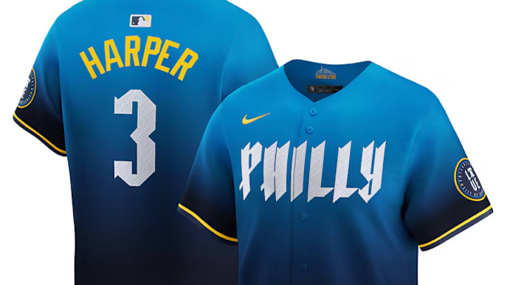
After months of speculation, the final product has finally arrived.
On Friday, the Phillies announced their rendition of the Nike City Connect uniforms, displaying "Philly" across the chest, something different from the classic "Phillies" that has been a mainstay for the last few decades. The "Unapologetically Philly" motto is the headline for the campaign emphasizing features of the city and the people within.
Unapologetically Philly. pic.twitter.com/8XzfifuZOR
— Philadelphia Phillies (@Phillies) April 5, 2024
Just like the many other uniforms released in the showcase of each MLB city, the new Phillies' look draws several aspects from Philadelphia and represents the people who call it home.
The reveal came with its own excitement. Just minutes after the new uniform was unveiled, an earthquake was felt in the Philadelphia area, foreshadowing the eruption from the city.
Plenty of positive fan reactions to the new uniforms
The new uniforms were little to no surprise to Phillies fans as the jersey had been passed around social media for the past few months in anticipation of the April release. Some fans were hoping that it would be completely different, while some were hoping it would look better on the players.
With a professional release added in with production, theatrics, and some pretty handsome athletes, a lot of fans changed their opinion on them, liking the complete look.
X user msad (@mikesadowsk22) captured the feeling of fans who like the "look better as a full uniform."
They look better as a full uniform, I love the hat..overall. Not THAT bad https://t.co/QD7V11ZUcY
— msad (@mikesadowsk22) April 5, 2024
PeteNova (@SuperrNova38) changed their mind after seeing the new uniforms on the players.
I know these were leaked but seeing them on the player makes me change my mind.
— PeteNova (@SuperrNova38) April 5, 2024
I like them 🔥
Yours truly gave a ringing endorsement of the actual uniforms, compared to how bad the leaked version looked. It's also hard for Bryce Harper to look bad in anything.
Whole uni is such a W. Crazy how bad the replicas looked.
— Jake Huber TDC (@JHuber_4) April 5, 2024
Also hard for that man to look bad in anything. https://t.co/XTBXR0z8N7
The gradient of the pants into the jersey meshes well and makes the whole look more seamless. The addition of the Liberty Bell caps, which are very similar to the popular spring training caps from this season, adds more normality to a uniform that is nothing like a normal baseball jersey.
Not all Phillies fans are happy with the extreme change
There is still a ton of backlash about the new uniform set. Many traditionalists and Phillies faithful aren't holding back in their opinions about them.
X user mpfeiffer (@PfeifferFamBam) wasn't swayed by the official unveiling and promotional material, "saying they're still ugly."
We all saw these jerseys a month ago. They are still ugly
— mpfeiffer (@PfeifferFamBam) April 5, 2024
SoCalPhillie (@SoCalPhillie) thinks that they're horrible but still concedes that the hat is nice. That's something at least.
Horrible. Hat is actually nice but F the rest
— SoCalPhillie🚀 (@SoCalPhillie) April 5, 2024
With a play on the Phillies' "Unapologetically Philly" slogan for the City Connects, Tiger Vibes (@Tiger__Vibes) calls the new uniforms "unapologetically the ugliest thing" they've ever seen. Tell us how you really feel.
Unapologetically the ugliest thing I’ve ever seen.
— Tiger Vibes (@Tiger__Vibes) April 5, 2024
It's understandable why some fans, if not familiar with the context behind why the Phillies chose specific colors, fonts, symbols, and designs, are on the negative side of the new jerseys.
Adding a blue and yellow uniform to a set of red, white, and blue is an uncomfortable thing for most. The new look is not that of a MLB jersey, but more of a college baseball or even a football jersey. When remembering that the Phillies recently ditched their red "getaway" tops for these, it is understandable that people would be upset.
While the city seems divided, the overall opinion has massively increased since the first leak months ago. The ability to accessorize and add their own personal flare will give the complete look a more all-around energy highlighting what it truly means to be from Philly.
The new look is very in line with other Nike City Connect uniforms we've seen, much like the San Diego Padres' City Connect jerseys, which incorporate colorful highlights that pay homage to the coastal city they call home but have no correlation to the team's color scheme.
The Phillies will sport the new look at every home Friday game for the rest of the season, totaling at least 12 games in the yellow and blue. Much like other teams, though, the Phillies will most likely find a way to incorporate them more into the uniform rotation, possibly sporting some different pants options as well.
