You've heard by now that the Philadelphia Phillies released their City Connect uniforms on Friday morning, with plenty of fanfare and online controversy over the new duds. With plenty of negative reactions to the new jerseys, it's only fair to let Nike and the team explain the design, which is wildly different from anything the team has seen.
Bryce Harper, for one, likes the new kit, even if it took him by surprise. According to MLB.com's Todd Zolecki, Harper was shown the design during spring training, and it took him a moment to voice his opinion — which was overwhelmingly positive.
“When I first saw them, I definitely didn’t think that was the vibe they were going to go with,” Harper said, per Zolecki. “I never thought blue, yellow, that kind of thing. I never thought those were going to be the colors.
So what did Harper think the City Connect jerseys would look like?
"I thought red or green for the Phanatic, or even black. Those were on my mind before I saw it," he said. "And then I saw it, and then I got the story behind it, and I thought it was cool. It’s way different than anything anybody could have ever imagined, but it comes together so well. The look, the story, everything.”
Nike explains design elements of Phillies' City Connect uniforms
As part of Friday's unveiling, the Phillies released a plethora of information about the design.
Making up Philly's fabric 🧵 pic.twitter.com/S6k625g2Y5
— Philadelphia Phillies (@Phillies) April 5, 2024
The noticeably blue collar connects with the city's hard-working, gritty side, showing respect and gratitude to the men and women who are out every day getting their hands dirty. The additional blue is combined with yellow, based on the Philadelphia flag.
Speaking of coloring, the two-tone change from light blue to midnight blue symbolizes the city's history of being "unafraid to revolutionize, start anew and work hard to make change."
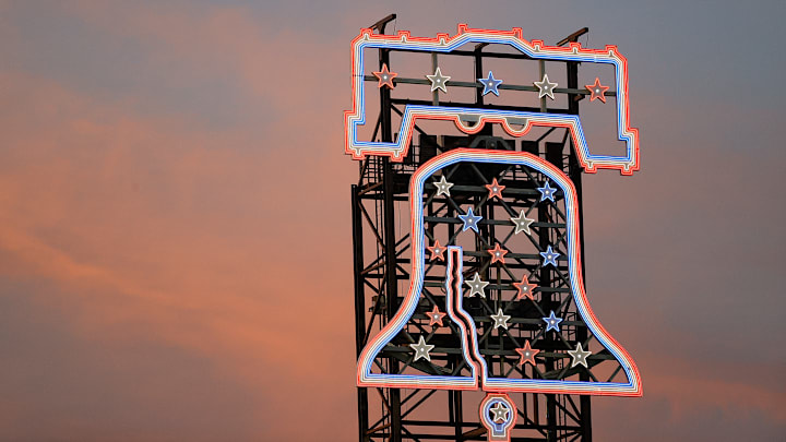
The cracked pattern on the chestplate pays homage to the iconic crack in the Liberty Bell that has become one with the team. The pattern also points to the city's imperfection, something that Phillies fans and citizens understand more than most. If you don't get it, you don't belong.
One of the biggest additions to the jersey was the City of Brotherly Love patch on the right arm sleeve. Within it holds multiple connections to the city, including the inscription "City of Brotherly Love" and the word "Love" set the same way as the iconic statue in the heart of the city.
The interior of the patch showcases an etching pattern similar in style to many documents found within the city during the time of the revolution. A baseball emblem is woven into the middle to represent the incredible connection the city of Philadelphia has with its baseball team.
The new cap features the iconic Liberty Bell, with a light blue skyline, sandwiched between two stars representing the stars in the traditional Phillies logotype. It's hard to see, but the "undervisor and sweatband feature filigree inspired by etchings on the Liberty Bell, and its placement reinforces that revolutions happen underground, a common theme in our city’s history."
So, there are all the details of the new design. For some fans, the explanation from Nike's designers might sway them to give the City Connect uniforms a chance, while others will continue to be less than pleased. Either way, they are here to stay, at least for this season, as the Phillies will wear them for Friday home games beginning on April 12.
