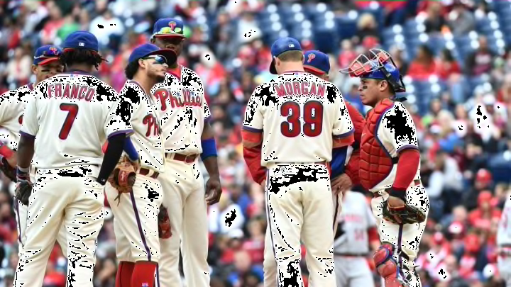
The Philadelphia Phillies were the first team in professional baseball to utilize pinstripes in their uniform, but even their classic look can stand improvement.
In general, the Phillies are pretty sharply dressed. The current version of the team’s primary home and away threads have been around since 1992 and have aged pretty well.
Those uniforms carry with them recent memories of the most dominant era of Phillies baseball to date, including just the 2nd World Series victory in franchise history, and show flashes of many looks from the club’s past.
As with anything, there is always room for improvement. Therefore, the organization opted to add cream home alternates, which are designed to reflect their 1940s look, for day games beginning in the 2008 season.
This year, another alternate was added when the team began wearing a red jersey during weekday day games. The jersey is reminiscent of a look which the club has previously used during batting practice and in spring training.
As I just mentioned, there is always an opportunity to improve something, so I will be looking at a few ways to do that with these alternates and beyond.
I think I speak for many Phillies fans when I suggest a greater role for the Liberty Bell logo that graces the Phils’ socks and is part of their baseball diamond-shaped primary logo. This bell logo embodies the history of Philadelphia and additional use of it would help solidify the current set of uniforms as a classic look.
There are a number of ways in which this logo could be utilized. The first of which is on both or one of their batting practice/spring training hats.

The Phillies continue to churn out similar-looking boring variations of a blue and red cap with a “P” on it. Meanwhile, many other organizations have taken the hat as an opportunity to get creative and use all sorts of interesting logos (mountains, sunbursts, etc.) The Phils should take a page out of their book and design a similar creative hat.
The bell logo should also make an appearance on their new red alternates by way of a sleeve patch. The primary uniforms already have a patch in the form of player numbers, and so a patch on the retro-style uniforms would not make any sense.
The red uniforms, however, make perfect sense for this patch. These unis were first introduced as spring training jerseys, with the spring training logo patch on the sleeve. It would have been a natural transition (and it really is not too late) to replace that patch in regular season games with a blue Liberty Bell, making the new jerseys more interesting than their current boring appearance
My final suggestion does not include the Liberty Bell and is probably my favorite. As mentioned earlier, the Phils’ cream alternates are made to be akin to a 1940s look. These alternate uniforms are without a doubt the Phillies’ best. But, they could be even better with an easy tweak.

The uniforms of that era utilized awesome red, white, and blue banded stirrups (pictured) which the Phils should bring back to wear with these uniforms, making it mandatory for each player to wear their pants cuffed.
This improvement would make a much sharper and overall more cohesive retro look. If the Phillies went through with something like this, these uniforms would surely be among the best in baseball, if they are not already.
Here’s to hoping the Phillies keep their borderline classic look of 24 years while keeping an open mind on ideas to improve their already fantastic style.
